
Typography is not just about choosing pretty letters; it’s a subtle art that shapes how we perceive and emotionally respond to written content. Every curve, stroke, and space in typography communicates beyond words, influencing whether a message feels trustworthy, playful, serious, or mysterious. Take, for instance, the effect of cursed letters – fonts designed to look warped or eerie instantly shift a text’s mood, making it unsettling and evocative. These transformations prove typography’s immense power: it’s the silent voice behind every text, guiding readers’ feelings and interpretations before they even process the meaning. When typography aligns perfectly with the content’s emotional tone, it elevates the entire reading experience, transforming simple words into compelling storytelling.
The Emotional Language of Fonts
Fonts have a unique ability to express feelings without uttering a single word. Each font style carries its own personality, evoking a wide spectrum of emotions. Serif fonts often suggest tradition, sophistication, and respectability, which is why many newspapers and book publishers favor them. On the other hand, sans-serif fonts convey simplicity, modernity, and efficiency, making them popular for tech brands and startups. Script fonts flow with elegance and creativity, often bringing a personal, human touch to invitations or artistic projects. Then there are bold, blocky fonts that demand attention and express urgency or power. But typography is more than just the font family; the emotion conveyed also depends heavily on finer details like letter spacing, size, and alignment. Tight spacing can create tension or urgency, while generous spacing opens the text, inviting calm and readability. Even the slant of letters—italicized fonts—can convey movement, energy, or emphasis. It’s fascinating how slight changes in form or space influence perception. For example, “cursed letters” fonts, which distort traditional letterforms with unsettling twists and flourishes, can create feelings of unease, mystery, or eeriness, perfectly suited for horror or dark fantasy themes. Designers often use this emotional language of fonts deliberately, tailoring typography to the message’s context. A wedding invitation might use flowing scripts to evoke romance and grace, while a political campaign may opt for strong, bold fonts to project authority and confidence. Understanding this silent dialogue between type and emotion enables creators to craft text that speaks to readers not only intellectually but emotionally.
Linnea Holgersson on Accessible Font Creation
Linnea Holgersson , a font artist, perfectly sums up how technology has broadened access to this powerful art: “With its intuitive interface, you can instantly generate and refine fonts to match your creative vision, making custom font creation accessible to everyone.” Her words highlight an important shift in typography. Gone are the days when creating beautiful, expressive fonts required specialized skills and software. Today’s intuitive AI-driven tools allow designers, artists, and even hobbyists to experiment and craft fonts tailored to their needs. Platforms like Creative Fabrica offer a range of font generators, including those that create “cursed letters” styles, enabling users to explore typography’s emotional depth with ease. This accessibility has sparked a creative renaissance, inviting more voices into the world of font design and empowering a diverse community to express themselves visually through text. 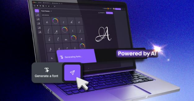
Crafting Emotion with Typography: The Essentials
To create fonts that resonate emotionally and communicate effectively, designers focus on several essential characteristics:
-
- Form: The shape of letters influences tone dramatically. Rounded, soft letterforms feel warm, friendly, and inviting, while sharp, angular shapes convey tension, formality, or urgency. For example, fonts with rounded edges are often seen as approachable and playful, whereas pointed serifs or geometric shapes can add seriousness or rigidity.
-
- Weight: The thickness of font strokes changes the emotional weight of the text. Heavy, bold fonts communicate strength, confidence, and importance, often used for headlines or calls to action. Conversely, lighter weights suggest delicacy, subtlety, or elegance, suitable for body text or refined designs.
-
- Spacing: Kerning (space between letters) and leading (space between lines) affect how dense or airy the text feels. Tight spacing can increase urgency or claustrophobia, while generous spacing allows the text to breathe, making it calming and easier to read. This balance is crucial in maintaining emotional tone without sacrificing legibility.
-
- Movement: Slants, italics, and varying baseline positions introduce a sense of motion or dynamism. Italics can express emphasis, intimacy, or elegance, while rigid upright fonts feel formal and stable. Movement in typography invites the eye to travel the text rhythmically, guiding the reader’s emotional journey.
When these aspects are harmonized, typography becomes a powerful emotional tool, capable of shaping perceptions before a single word is fully read.
Typography’s Role in Visual Storytelling
Typography is an essential partner in visual storytelling, often conveying mood and meaning before the content itself is processed. The font sets the stage, framing the narrative with emotional cues embedded in every letterform. For example, jagged, distressed fonts evoke suspense and unease, making them ideal for horror or thriller stories. In contrast, smooth, elegant scripts communicate romance, nostalgia, or sophistication. This visual language enriches the story, ensuring the audience’s emotional response aligns with the narrative intent. Beyond storytelling in books or films, typography influences branding, advertising, and digital media. Brands use signature fonts to express values and connect emotionally with customers. A fashion label might use sleek, modern fonts to project luxury and exclusivity, while a children’s brand may opt for playful, rounded fonts that feel friendly and safe. In marketing, the emotional impact of typography can make the difference between a forgettable message and one that resonates deeply. Great designers understand typography is not just decoration but a vital element of communication that breathes life into words and guides audience feelings.
Conclusion
Typography is a dynamic art form that, when wielded thoughtfully, transforms text into an emotional experience. Thanks to AI-powered font generators and creative tools, anyone can explore and create fonts that evoke specific moods and messages—from joyful and playful to dark and mysterious, like “cursed letters” from Creative Fabrica. These advances invite experimentation, pushing creative boundaries and enabling deeper connections through text. Whether you’re a designer, marketer, writer, or hobbyist, embracing typography’s emotional power elevates your work. It allows your words to resonate beyond meaning and strike a chord in readers’ hearts. Explore font creation tools, refine your choices, and let typography amplify your stories and brand identity. In this new era, font design is no longer limited to experts; it’s an accessible, expressive craft open to all who wish to shape perception and stir emotion through the art of letters.

